There is no way, I can list all the works and shows I have seen and liked this year in the city. Toronto is bursting at the seams with high quality art and cultural events. I try to scratch the surface just as much as I can and also be content with sense of JOMO (Joy of Missing Out), a term a great colleague introduced to me, instead of FOMO (Fear of Missing Out). Here is some efforts make a note of top memorable works and shows.
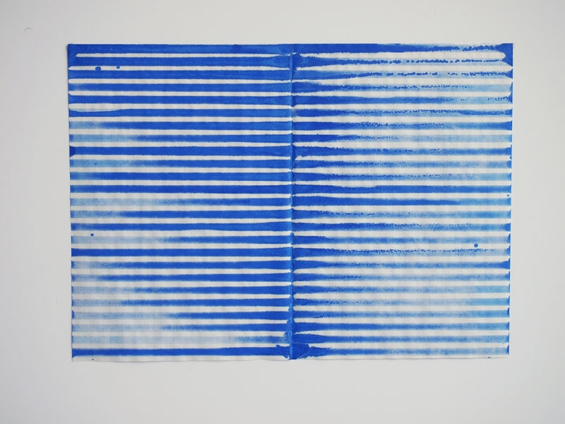
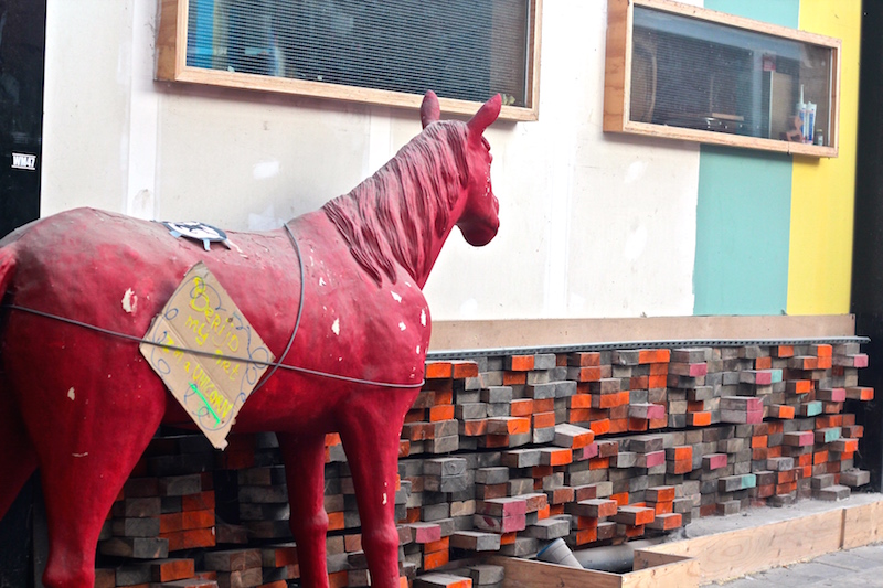
Fine Line’ Group Exhibition atOlga Korper and the gem is this piece, 100 yards, hesitating every inch of the way by Ken Nicol Superstratum by Morgan Wedderspoon at Open Studio
The vibe of Art Toronto 2019 was airy and great this year. This piece from Hernâni Reis Baptista, Portugal won my heart. It is flesh and bruises done with makeup powders. It had a mysterious beauty to it and definitely looked better in flesh!
I was quite taken away but Kröller-Müller Museum, this gem of a museum in a quiet Dutch town of Otterlo, hidden in the serene and studding setting of De Hoge Veluwe National Park.
I had no idea that Kröller-Müller contains the second-largest Van Gogh collection in the world. It is a fascinating story how the vision of one single collector, Helen Kröller-Müller, the first European female collector, brings attention and shines light on Van Gogh’s work. The museum also hosts one of the largest sculpture gardens in Europe. Everything about the experience is special. The unique setting which is tucked away from the hustle and bustle of big cities inspires a sense of calm and reflection that connects you deeper with the works.
Enclosed wheat field with rising sun, 1889 Vincent van Gogh
Composition in colour A, 1917. Piet Mondriaan
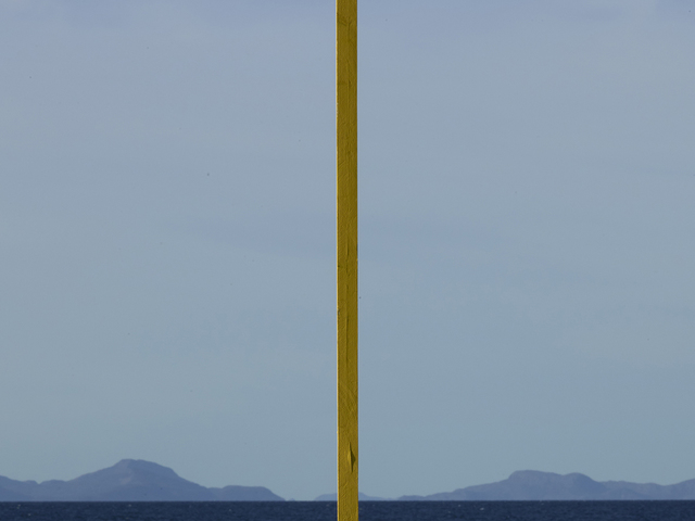
Needle Tower, 1968, Kenneth Snelson
Mauritshuis
Mauritshuis in The Hague is one of my most favourite museums in the world – a quaint and intimate one. This repeat visit just rekindled my love and admiration for the works of the seventeenth-century Dutch and Flemish painters and the Dutch Golden Age.
I am absolutely in love with Jan Steen’s paintings of mundane everyday life, the romantic still life paintings, and incredible portraits of the masters, Vermeer and Rembrandt . You can see most of their collection online with high resolution details. It is a treat.
Kitchen Scene with Christ at Emmaus, 1560, Joachim Beuckelaer
Kitchen Interior 1644, David Teniers II
Panorama Mesdag
Panorama Mesdag was yet another surprise, delightful discovery of a genre of panoramic paintings that I had never heard of. This is a cylindrical painting of 120 meters with a height of 14 meters by Hendrik Willem Mesdag and it is the oldest 19th century panorama in the world on its original site. It is a 3D experience of the fishing village of Scheveningen. The villages, the sea, the dunes are painted beautifully and augmented by real sandy dunes, rocks, seashells, beach chairs and sounds of the sea. The line between real objects and painting blends and since you are surrounded by the painting it feels like you are in it too. The dome of the structure is transparent so the changing light of the sunshine and the moving clouds change the color of the sky in the painting in the course of the day. They call it an ancient virtual reality and it truly is. Obviously the real experience is surreal and better but you can get a glimpse of it here if you are curious.
Joana Vasconcelos at Kunsthal Rotterdam
Ok, I am a late discoverer of Joana Vasconcelos’s work but now she is my artist crush of the year!
Her installations and their scale are just epic. Her daring, super intelligent, humorous take on gender issues, contradictions in female roles and her approach to social commentary with her art blow my mind. Chandelier made of tampons! Stiletto made of cooking pots! Just wow!
I don’t remember having been this knee deep into seeing art, producing art and making art in such a full cycle and as intense as this year.
I thought it is best to capture these memories at the end of the decade here to remember inspiring experiences and to share with you a snippet of these discoveries.
I closed the year, fulfilled, by creating a new body of work for my new show, quiet vignettes, part of DesignTO Festival. I will tell you more about it soon.
My passion has been, for the past fifteen years, to bring audiences and artists together to share moments of joy, engagement and stimulation that happens through creative exchange. Leading Toronto Outdoor Art Fair continues to be an enriching, intense and rewarding endeavour that fulfills that passion.
This year also unusually was filled with visits to some major art events like the Venice Biennale, Frieze New York , The Other Art Fair and discovery of new museum gems, great exhibitions and performances (a separate post on that will follow). There was no shortage of incredible works of art, old and new, jaw dropping, beautiful, thought provoking as well as works that I wanted to take home with me to keep forever (which we did!).
So here are my selected highlights of 2019 art adventures.
Venice Biennale – May You Live In Interesting Times
Visiting Venice Biennale was one of those bucket-list wishes that came true this summer. Two full days was barely enough to scratch the surface and to take it all in. I feel I missed a lot of important works but still captured some moments that has stayed with me since.
It’s impossible to list everything that inspired me or highlight the works I saw. There is a catalogue for that written by professionals :-). For me, Venice Biennale filled was filled with intellectual, social and political work and most of them required focused attention, reading statements and deep engagement which is hard to achieve when you are visiting with little kids. I was at first overwhelmed by the task of reading about the works for context and thought I won’t get what I need from the experience. However, to my surprise the work descriptions, the curatorial and artist statements were written in such clear, simple and engaging language that made the viewer more curious about the artists and their intent.
I sometimes get weary of reading artist statements that are dense, heavy and intelligent sounding at the expense of making the audience feel unintelligent. If the work is great and connects with my heart that’s ok and I can dig more into it but that’s not often the case. I caught myself trying to read every single statement throughout the show and I even managed to explain them in a simpler language for the little ones and they made their own connections in their own way. The experience was stimulating and inspiring and I left with a great deal of food for thought.
Here are some of the works that has stayed with me.
Carol Bove – I don’t know how many times I went back and looked at Carol Bove’s sculptures!
This is what’s told about her work: The formal syntax of Carol Bove is bends, dents, twists, torques, kinks, crumbles, creases, and other folds that animate the sculptural surface. No wonder why! I love folds and creases 🙂
Mari Katayama’s intricate and invigorating self-portraits just mesmerized me.
Loved this painting of roots of bamboo groves and trees that were entangled with garbage by Handiwirman Saputra and his equally captivating sculptural installation.
One Day in the Life of Noah Piugattuk by Isuma artist collective atCanada Pavilion is captivating and eye opening. We only got to see 30 minutes of it there but plan to watch it on isuma.tv.
Poland’s pavilion featured a real inside-out aeroplane! “Flight” by Roman Stańczak was an instant hit with the kids! Not sure if that was their target audience but hey get them curious when they are young 🙂
And this piece: Flesh in Stone by Yu Ji!
sun yuan and peng yu works are jaw-dropping and somehow intense. can’t help myself and present dearwere two of the most monumental and visceral works that had a lasting impact on all of us especially the little ones. Click on the links for proper images and videos.
And the last memorable moment was the loud and fun design of this cafe (minus the impatient and grumpy service).
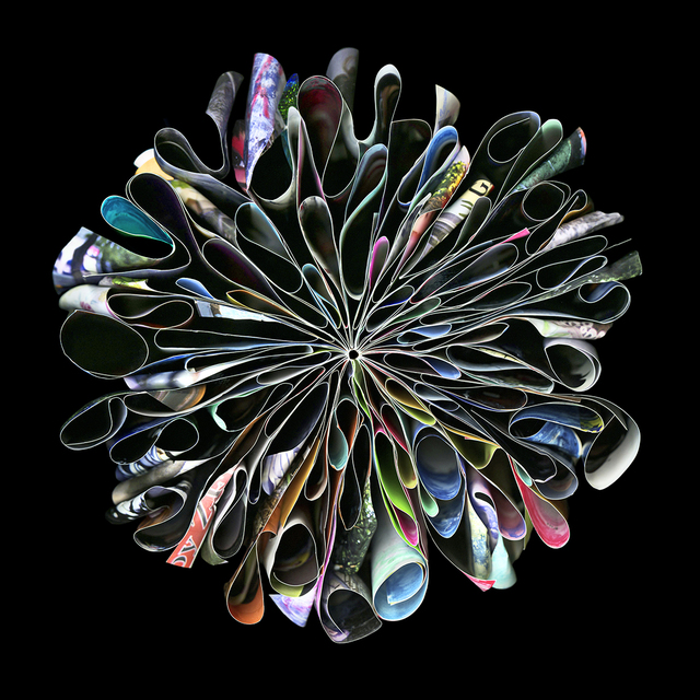
Here are some of the photography works I loved at Art Toronto 2015. I enjoyed Bau-Xi gallery‘s fantastic selection of works and artists. There were a lot of great pieces that you can view here on Artsy’s coverage of the fair.
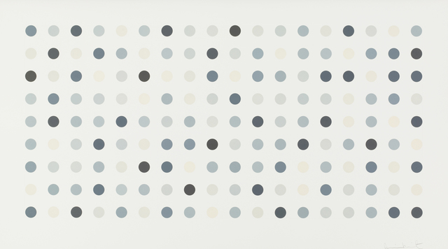
I started my tour of Art Toronto 2015 quite enthusiastically and energetically, determined to document everything that caught my eye and liked and make a visual archive for myself. But of-course that was quite an ambitious task to sift through over thousands of works on display. There was lots to see and to admire. I was excited to see original Damien Hirst print editions or it’s better to say seeing a Hirst’s work in person for the first time was exciting. I love dots and I can’t get enough of these spots. I “wish” to own a print one day! I also spotted a small Banksy piece somewhere but I forgot which gallery it was. The most original new work for me was DaveandJenn at TrépanierBaer Gallery. The works are detailed paintings/collages within multiple layers of resin and they weave together a vivid,colorful and surreal world. Their instagram captures some essence of their work but seeing in person is a completely different experience. ( I have a picture below but it doesn’t do the work justice! )
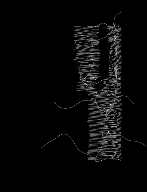
Another memorable, brilliant piece that drew me back a few times was from the Cluster Fuck series of Ken Nicol at Olga Korper Gallery (That gallery had the best selection of works in my opinion.) The image below is not the one that was displayed, that piece according to this video contained 200,054 fucks meticulously and beautifully handwritten in a mesmerizing, complex grid.
I was so pumped and inspired visiting Amsterdam Drawing Fair 2015 that I wanted to jump on a plane to get back to my studio and let out some of the ideas that popped up in my head. The rush is behind me but they are still brewing. The variety of works that pushed the boundaries of drawing in many different ways were countless. The vibe of the fair was laid-back, unpretentious and inviting. Visitors were engaged , interested and invested! A lot of works were sold – lots of red dots all around. It was refreshing to hear from friends that this was an affordable art fair that they looked forward to getting some high quality art.
I lost track of the pieces I loved and I didn’t have time to document them all for my visual reference but here are some of the highlights of the artists/pieces that I fell in love with for various reasons. I took some pictures but my shots were poorly lit so I used google and aimed to link /credit properly.
These beautiful patters and textures drawn via chemical process by Nora Schattauer
permanganate 23, 2014 mineral solutions on chromatography paper 30 x 20 cm
ocher Green 5, 2012, mineral solutions on chromatography paper, 30 x 20 cm
meticulous drawings of grids, patterns and orders by Michelle Grabner. “her work seeks Platonic ideals of orderliness and routine.“
Without title, 2002, watercolor on paper, 120 x 160 cm
Dineke van Huizen had stunning pieces from painted paper-cuts. I can’t find her website but here is the link to Rejane Louin gallery that represented her. I absolutely loved works by Maëlle Labussière from the same gallery.
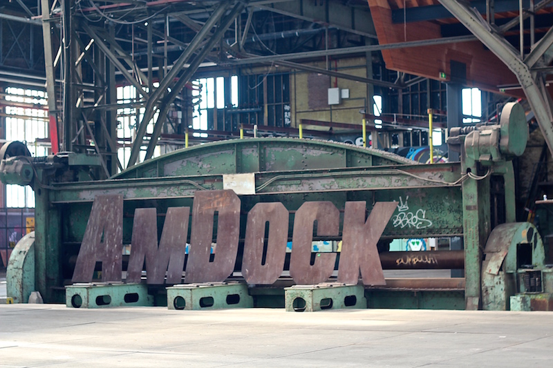
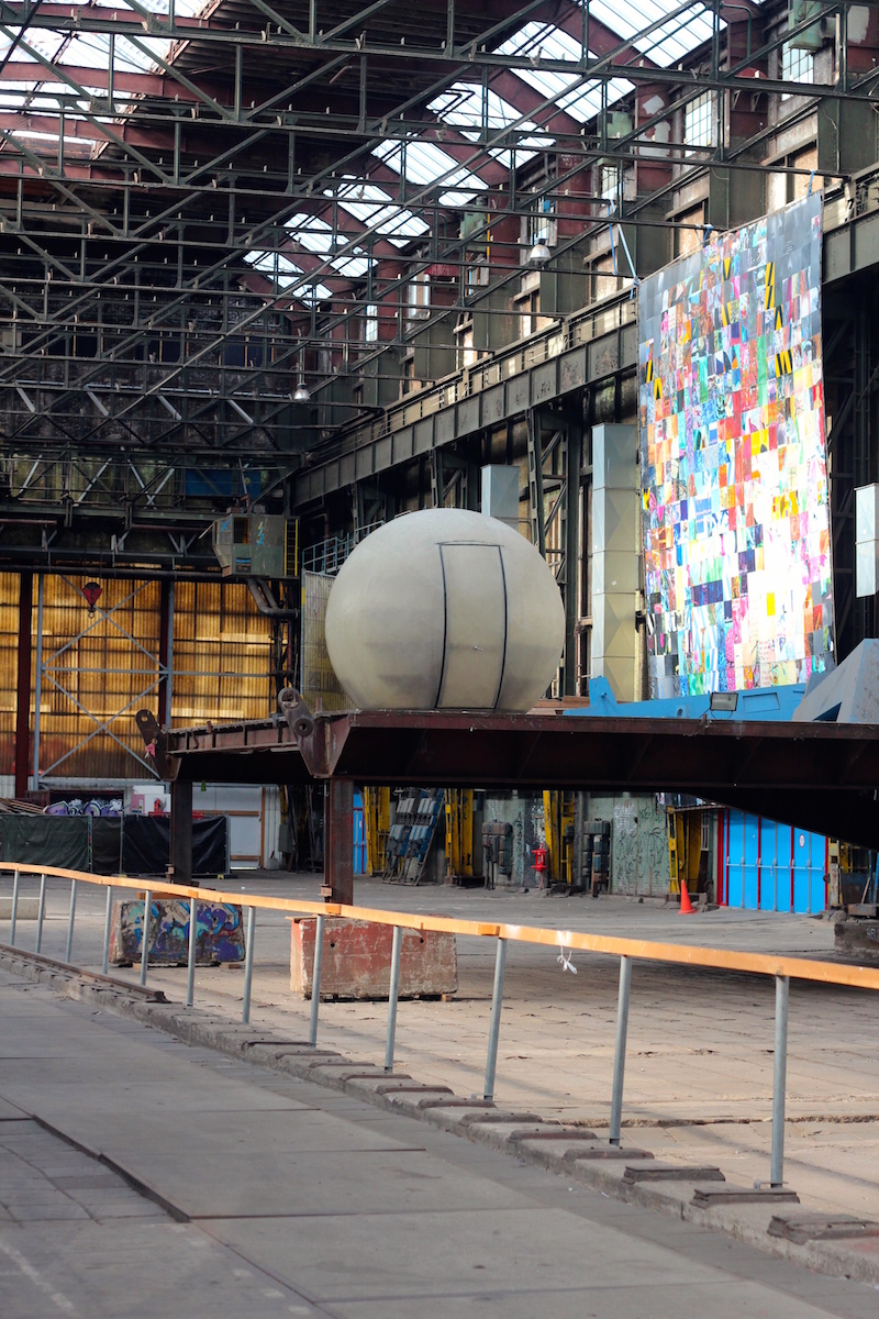
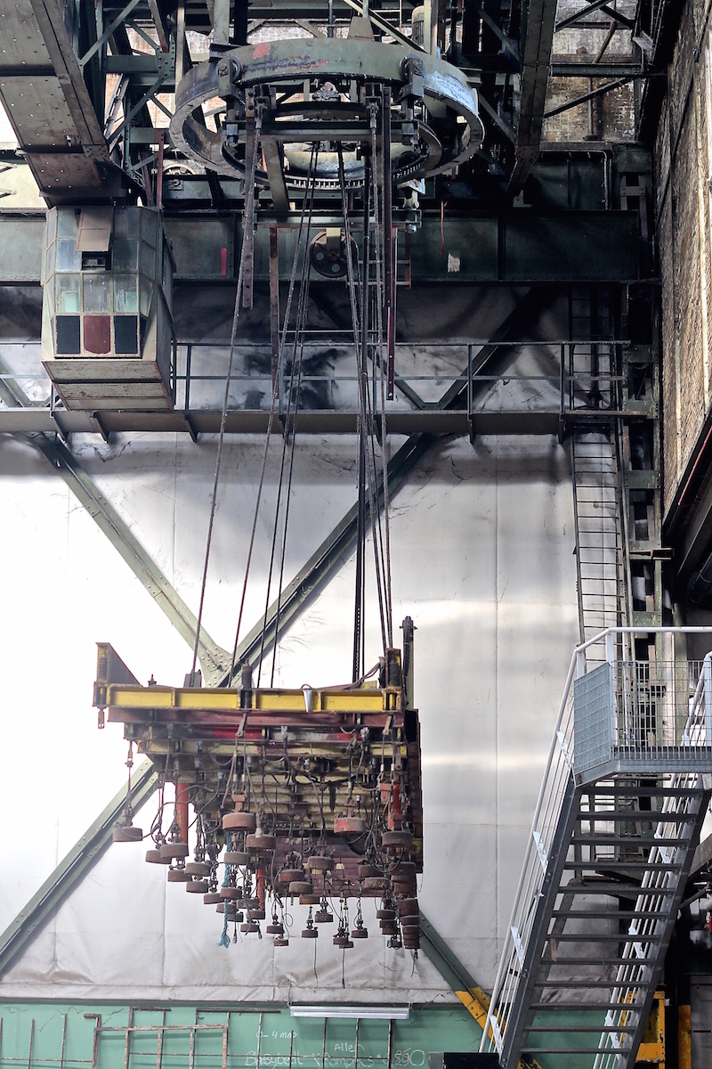
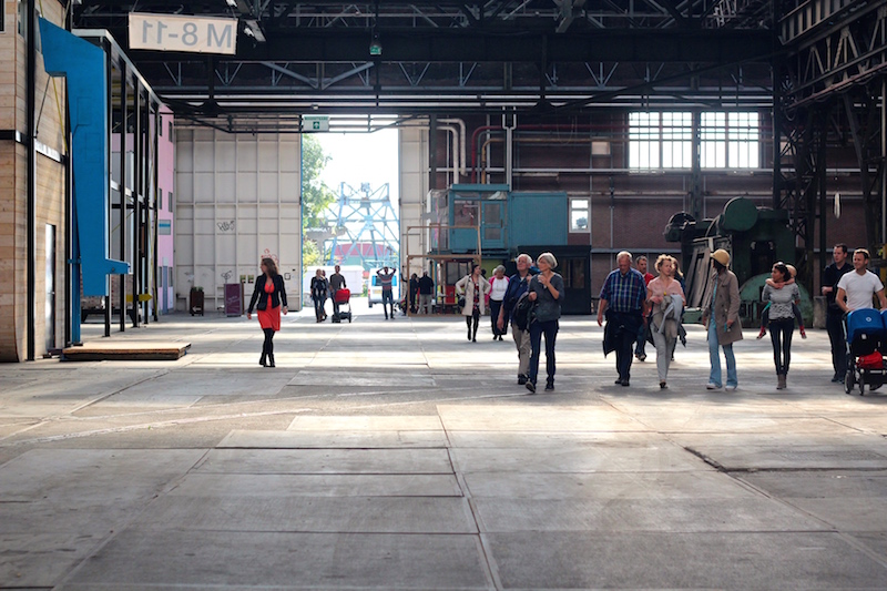
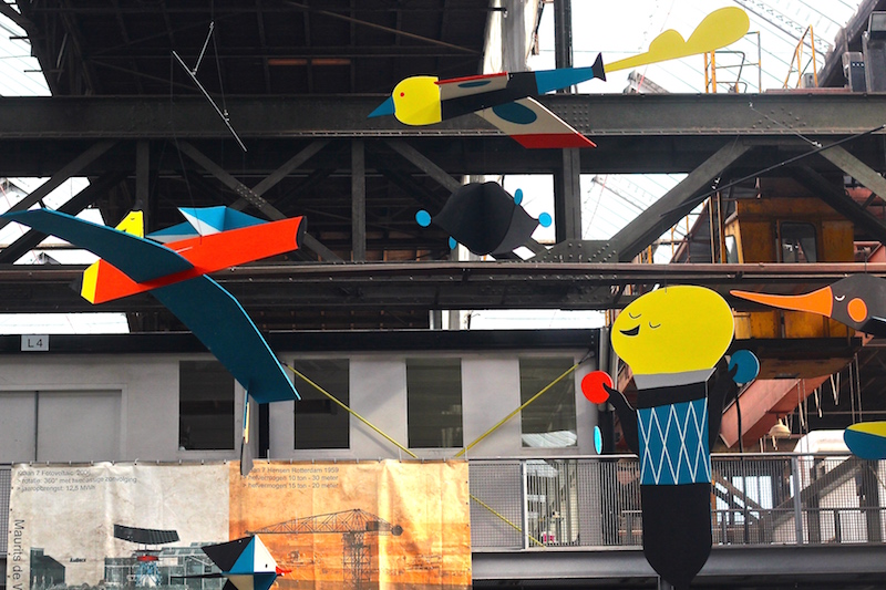
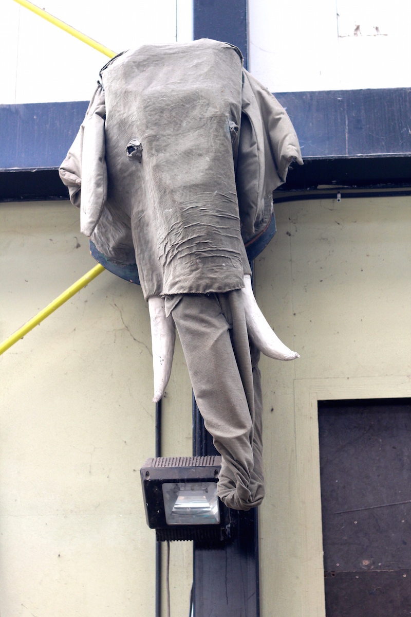
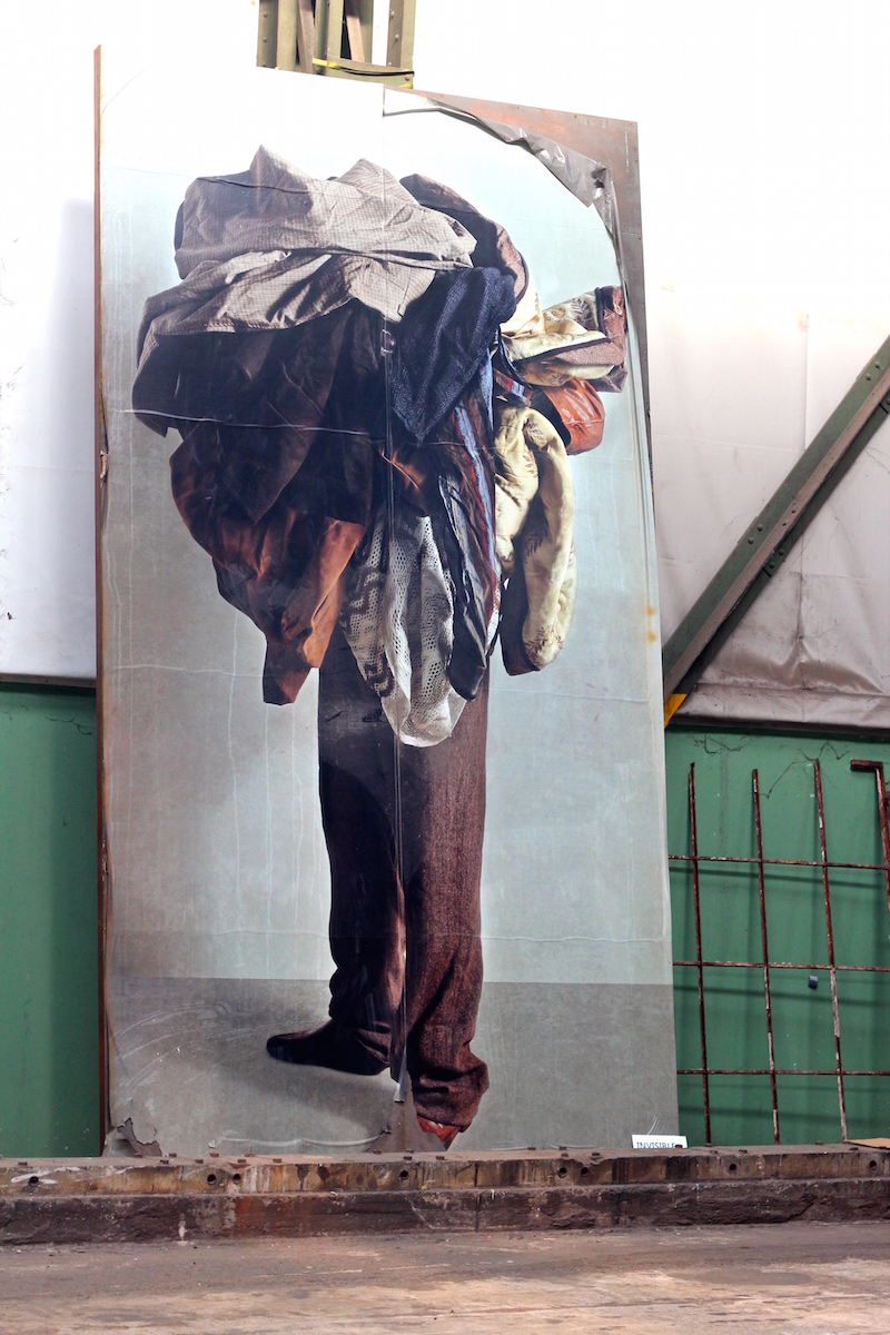
And NDSM doesn’t have to try to be cool! It simply is. It is a self-proclaimed self-made city on the remnants of the old shipping industry – used to be the biggest shipyard in Europe. It is described aptly by themselves as “vivid, intense, highly contrasting and unique” and you experience all of those qualities when you walk around. I have a separate post about the amazing Amsterdam Drawing Festival that was happening in this zone. But here are some pictures of the shipyard itself and some artworks that were enhanced by the magnificent industrial backdrop.
and this quintessential Dutch corner at the shipyard!
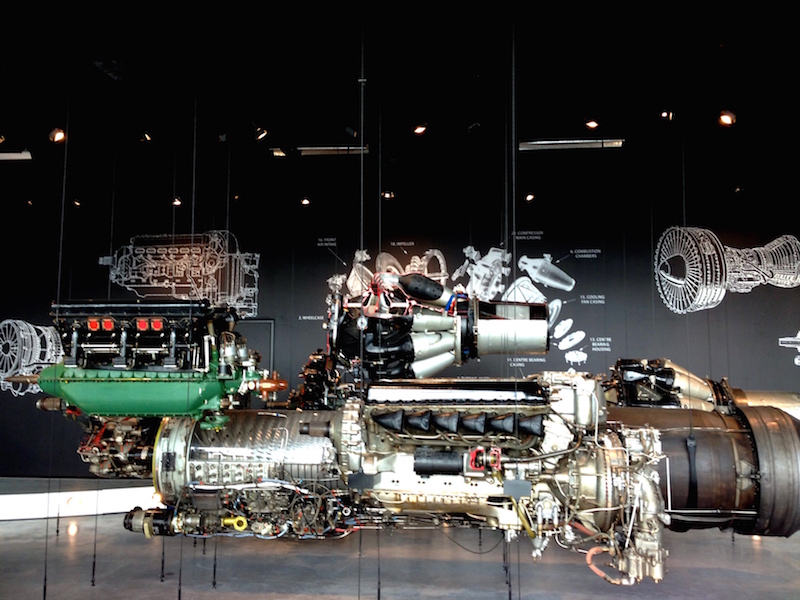
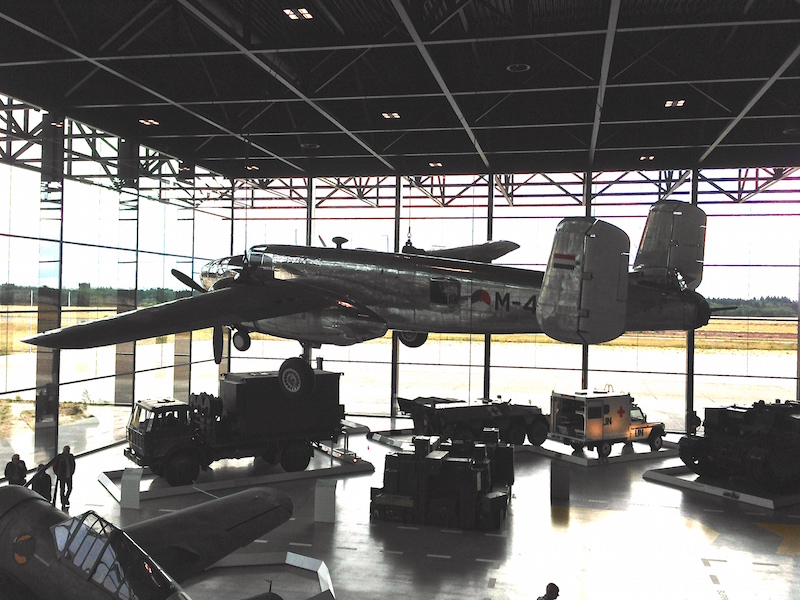
5. national military museum vs. nijntje museum (not in Amsterdam)
I have zero interest in war and military related anything! But I was told this new national military museum in Soesterberg was a different kind. And it was. The architecture of this building which is situated in a forest is state-of-the-art. It is one of those structures that makes you feel united with the beautiful landscape outside, you can watch the parade of the dutch clouds in the sky from every corner of the museum, feeling that you can touch them and yet you are shielded from atrocities of the weather. Everything from the interior design, traffic flow design, graphic design, display design, signage, furniture, you name it…is impeccable, harmonious, yet simple and super elegant. I am holding on to my ticket stub and brochures as I loved everything about the layout, typography and design (again!) The highlight of the museum for me, beside the space itself, were its modern and interactive multi-media exhibitions and installations ( I haven’t seen such quality anywhere else yet.) Through these, they had done a fantastic job of grabbing the attention visually to tell the captivating narrative that wove the history and essence of the Netherlands with its involvement in wars and the world politics. And since it was a military museum after all, I was impressed by the sight of the fighter jets and aircrafts dangling in that grand space.
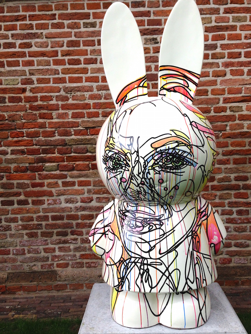
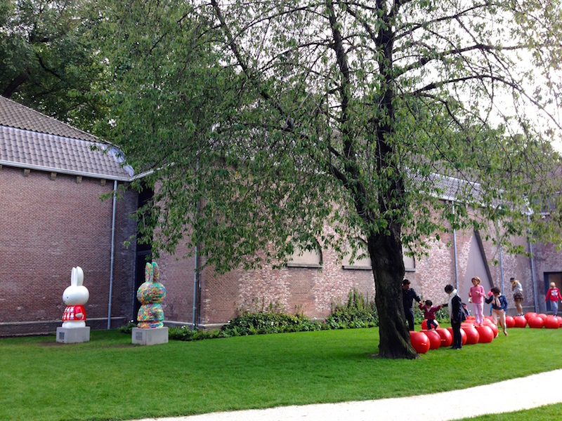
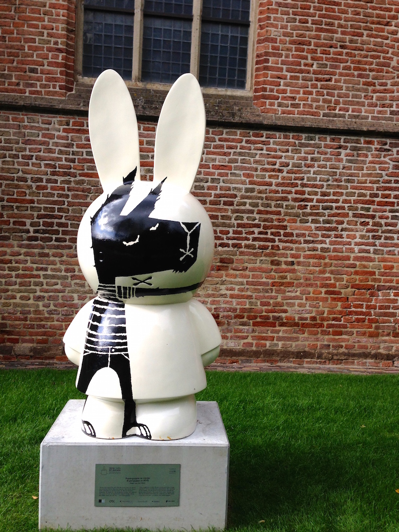
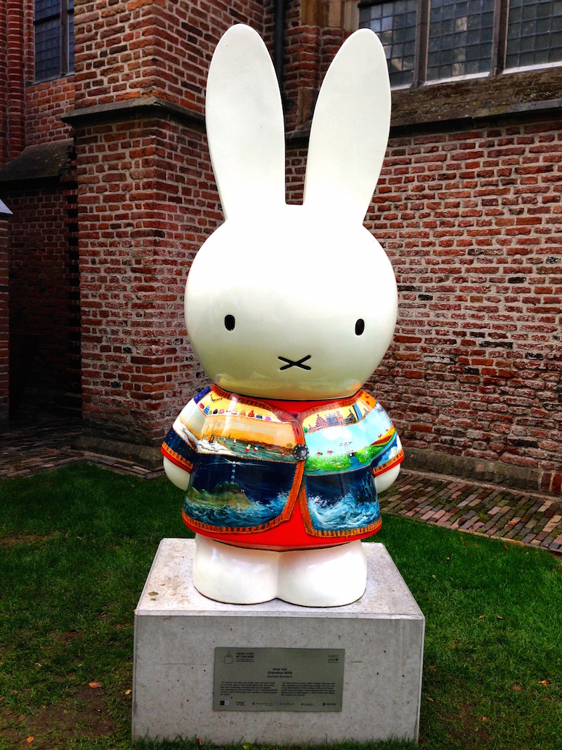
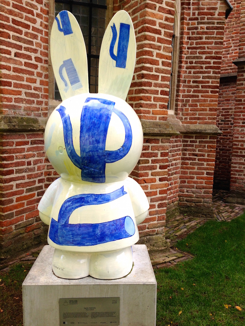
On a complete opposite note, nijntje (miffy) the iconic creation of the Dutch artist Dick Bruna, turned 60 this year so even the traffic lights in Utrecht (nijntje’s hometown) adopted the character for this milestone birthday and there is a whole new museum dedicated to the little rabbit. The museum is obviously kid’s centric but it is professionally designed and tastefully executed. The quality displays serve all visitors alike. Some statues designed by great artists for the nijntje art parade (recently auctioned off for UNICEF’s education projects) were on display, this link has the images of all the different designs and they are just fantastic.
It has been a while since my last post. I have been silent but quite busy with some new works (to be added), loads of visual research, freelance work, serving on a fantastic arts jury for Ontario Arts Council, spending a month in the Netherlands and everything in between except social media.
I thought it is best to resume where I left off by sharing some artsy highlights of my trip.
1. Stedelijk
I have been to Amsterdam many times and never seem to be getting enough of it. There is never enough time to absorb all the great art that’s available. This time I turned my focuse from the masters to everything contemporary starting with Stedelijk Museum. The architecture of the museum (boat or kitchen sink?) and the logo are quite eye catching. I had heard about the discontent over the museum’s new logo but I actually loved the design and I think it is pretty ingenious as it spells out the name of the museum in one single letter. minimal, distinct and modern.
La perruche et la sirène – Henry Matisse, 1952
loved this piece – When Ardour is Replaced by Ennui – by Cosima von Bonin
Besides the great historical and contemporary works of art and the breathtaking Matisse, I particularly enjoyed the astonishing collection of posters, catalogues and the iconic dutch graphic design archives including works of Wim Crouwel, one of 20th century’s most important designers and the founder of Total Design. Some of these 50’s and 60’s posters are simply timeless, as are the Scandinavian century modern furniture and objects. I would like to go back for a more focused research.
Vormgevers – Wim Crouwel 1968
Edgar Fernhout -Wim Crouwel 1963
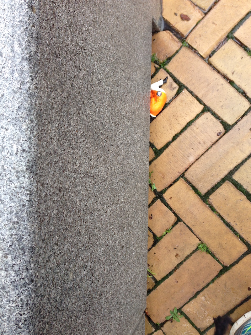
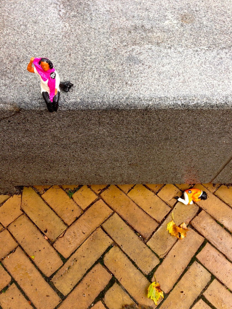
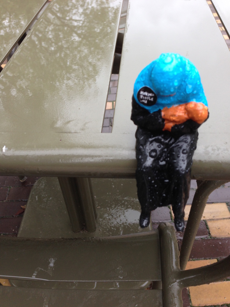
2. political/social art installation
On a walk around Artis on a rainy day, I spotted this miniature figure and thought maybe someone had dropped it, then I saw them scattered around on random benches, fountains and sidewalks. It instantly reminded me of little people by Slinkachu and I was excited to have stumbled upon such an art installation but looking closer it became obvious that this was a response to the Syrian refugee crisis. I found out the installation #MovingPeople was a guerilla art project organized by Power of Art House, an artistic think tank consisting of designers, socio-cultural entrepreneurs, producers, and other creative thinkers who distributed 10010 miniature refugees in the city. You were supposed to move them and share their stories via social media and they were actually 3D scans of former refugees ( I read about this later). Subtle yet powerful and capturing.
3. gallery hopping
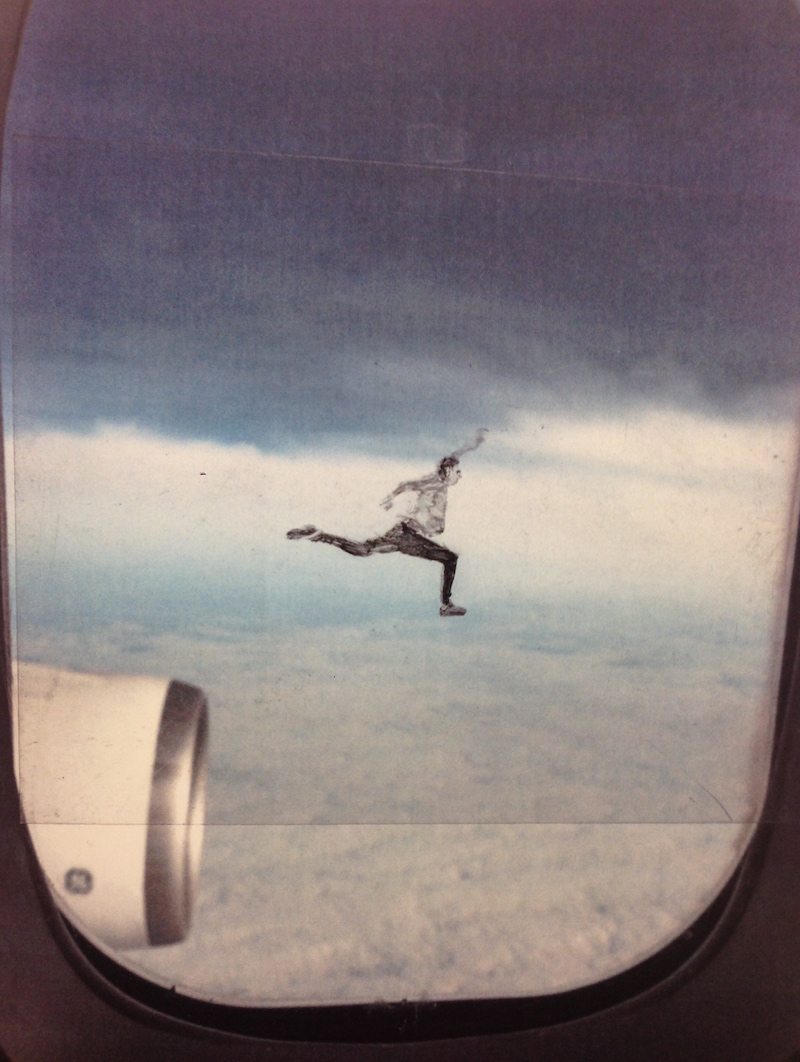
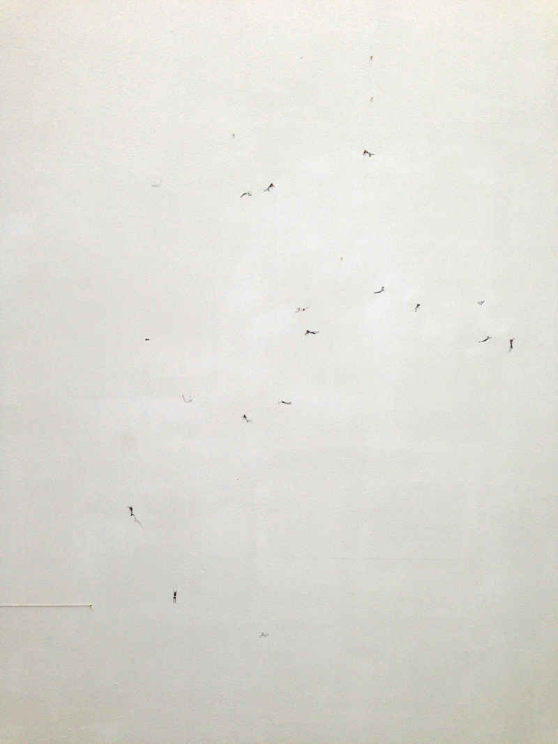
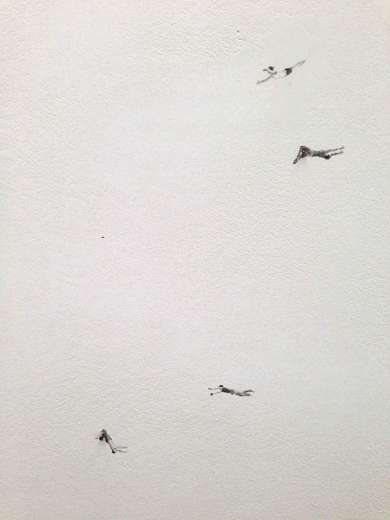
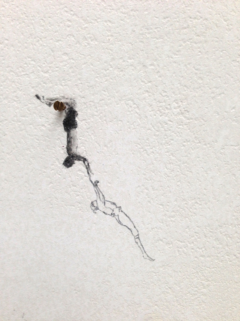
the most memorable of my gallery-hopping in Amsterdam were the works of Claire Harvey at Galerie Fons Welters. In her postcard series you see these folks on the wing of planes in various states of being. I loved the angle and how she took me with her into the clouds. Her imagination is etched in my mind, now whenever I get that same view on the plane, I picture myself sitting on that wing, dangling my feet looking through the clouds down to the earth. The other part of this exhibition were these miniature swirls of figures hand drawn on the gallery wall which looked like dots from the distance. I found myself captured by their movement and was curious to know where they were going. This show is until October 17th (if you are in Amsterdam.)
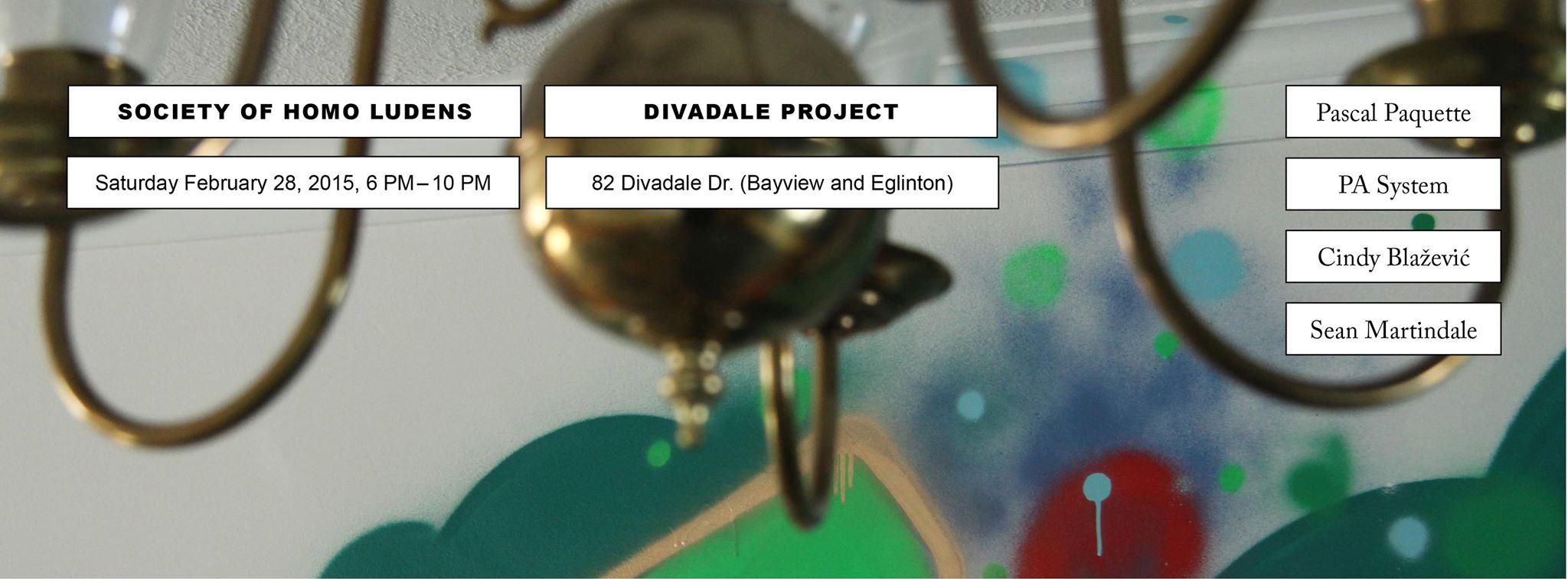
This is a bit last minute but there is still time! If you are free tomorrow night, dress warm and take your adventurous spirits to 82 Divadale Drive, to catch Divadale Project : A Trespassing Event. It is a final day of a house before its demolition and some very cool artists have taken over this giant canvas. The brilliant creative force, Talayeh Hamidya and Gelareh Saadatpajouh of Society of Homo Ludens (SoHL), are at it again. It is the most original and coolest art event happening so don’t miss it and don’t forget to get your tickets!
Once in while, I see works that I get a strong visceral reaction to and feel an invisible pull towards them. I can’t quite describe it. It’s a sort of feeling I have towards certain style of contemporary dance. Usually there is this sense of abstract movement or a kinetic energy as well as a sense of architecture and other elements that create this strong connection for me. It is expected and obvious in dance but not so much in two dimensional works. Hardly I have seen these two art forms being compared to each other. It is not often that I myself perceive such a connection.
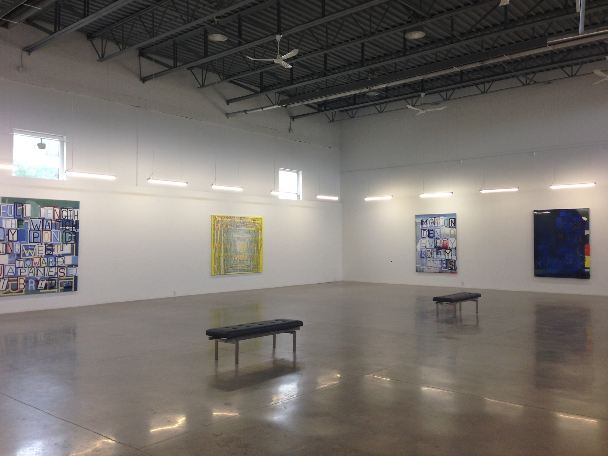
The above show where I discovered the works of internationally acclaimed Graham Gilmore for the first time was one of those. Everything about these text based paintings, from the vivid colour palettes, textures, texts, meaning and their ambiguity translates in a beautiful abstract dance. Obviously, I am not an art critic so I just describe my own feelings and connection to the work and I leave the description to the artist and the critique to the experts.
These two pieces below were my most favourite. The images don’t do justice as I snapped them with my phone so go and see the real thing for yourself and check out the artist or gallery’s website for better images.


 Alberto Casari, EM.SB.13.05, 2013, Fieltro teñido calado y madera


 Yves Zurstrassen


 these captiavting red dots by