January 2017


< go back to blog overview

what does design week do to me…

It is Design Week/Month in Toronto and there is buzz everywhere from Toronto Design Offsite, Interior Design Show to DO Design. My busy schedule doesn’t allow me to see all the awesome exhibitions that are out there, I am seeing a few but there is no way I can catch up with the buzz. However, this energy always makes me look at January as Design Consciousness month and it is a perfect timing as I am reflecting on life and setting the threading theme for the year.

I am looking around me to get a better idea of what my design diet consist of. I don’t have much expertise in the field except for great appreciation of good solid design and having developed an eye or taste for it (in certain areas). I have become more and more focused and selective about what I surround myself with. I am a sucker for clean, simple, minimal and functional objects. I don’t have space in my home nor my brain (more so than my home) to spend it on managing stuff. And still I find most of my non-work time is spent in the department of Stuff Management.  To get myself out of the constant state of de-cluttering, I am constantly changing my consumption habits and I am gravitating more and more to implementing good design in every aspect of life. Even my wardrobe is moving more towards becoming a capsule closet filled with essentials. I have been sticking to a very minimal colour palette of black , white and grey with a pop of colour as a rule of thumb for everything for quite some time now. My focus over the years has shifted to quality vs. quantity. It has been liberating and efficient and I am becoming even stricter with it. This is a wave everywhere (or maybe in some areas trendy but one of those good trends) and it is a good way of living. To do more with less! It is hard but it is so good if I can stick to it.

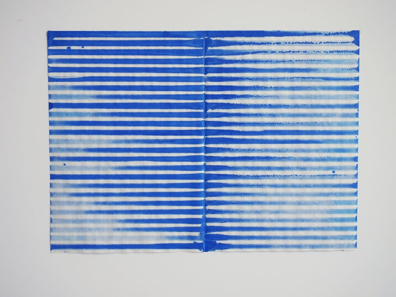
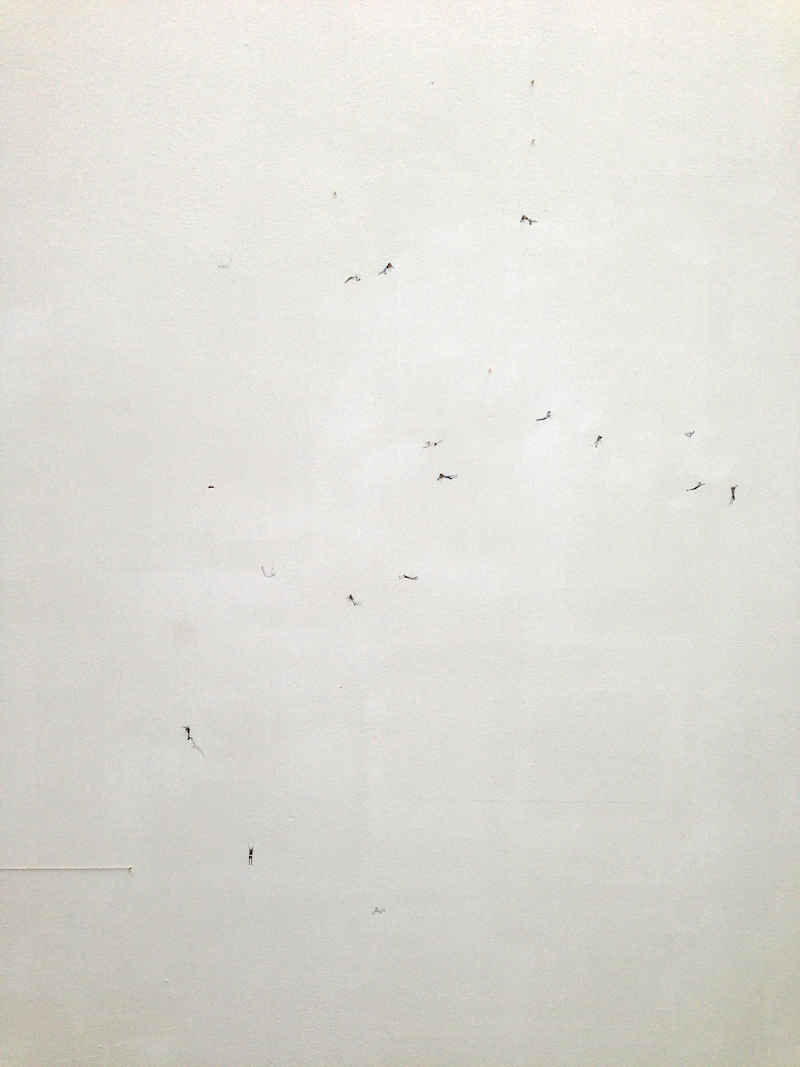
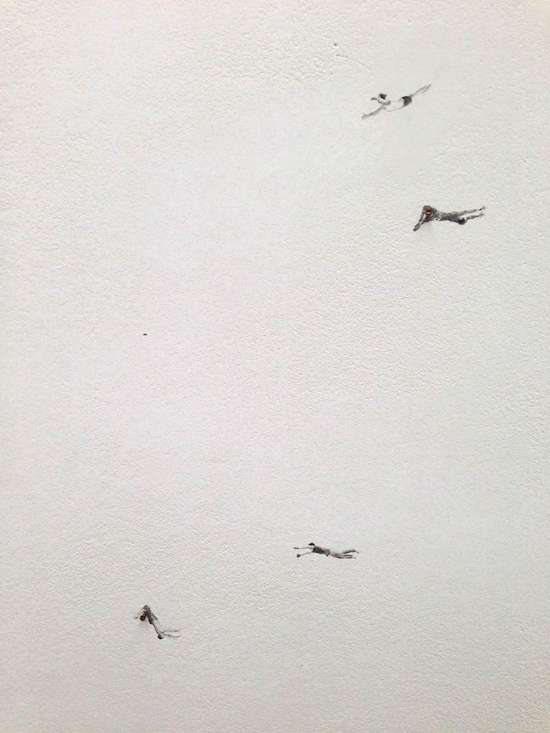
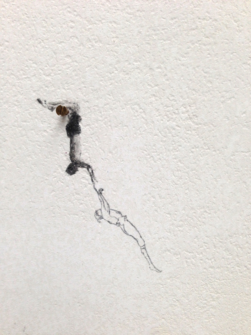
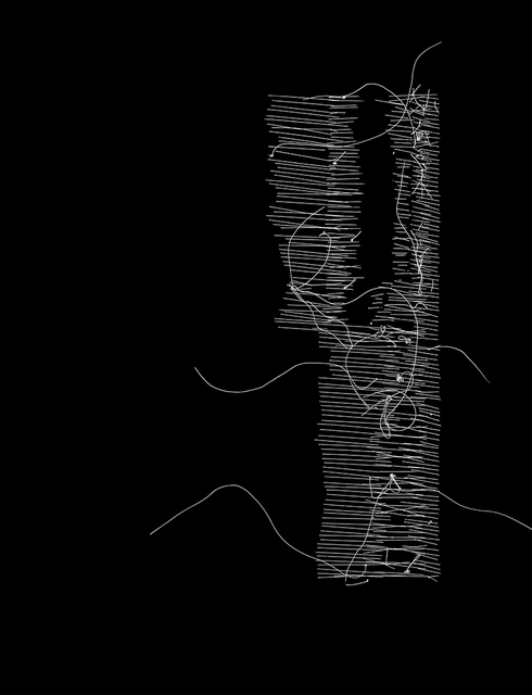
As you have seen over the past year, this thinking has trickled into my collage work and has changed it drastically. In the research phase I took on myself, I aimed to reduce and minimize my previously dense collage explorations to essential, minimal forms, lines and characters and try to take the attention to simplicity of small fragments. It has been a good practice.

Since some of those works are at the Interior Design Show this week and to pay tribute to the Design week/month and what I have been thinking, I thought to attempt to minimize the work even further and delve deeper in to the cut-out forms and lines.

The palette is black, white and grey. My favourite is the first one with the felt.

192-collage-2017-anahitaazrahimi 193-collage-2017-anahitaazrahimi.JPG
194-collage-2017-anahitaazrahimi.JPG


Art Toronto 2015 – Favorite Photgraphs

Here are some of the photography works I loved at Art Toronto 2015. I enjoyed Bau-Xi gallery‘s fantastic selection of works and artists. There were a lot of great pieces that you can view here on Artsy’s coverage of the fair.

Katrin Korfmann-Ibi

Katrin Korfmann, Ibi

Katrin Korfmann-Homo Ludens 42

Katrin KorfmannHomo Ludens 42

Joshua Jensen-Nagle-Bathing in Bliss 2015

Joshua Jensen-Nagle, Bathing in Bliss,  2015

Ned Pratt-Connaigre Peninsulam 2015

Ned Pratt, Connaigre Peninsula, 2015

Milagros de la Torre, Imprint 2010

Milagros de la Torre, Imprint 2010

cara barer-Harajuku, 2015

Cara Barer, Harajuku, 2015

Nadia Myre-Orison #4 2014

Nadia Myre, Orison #4, 2014


Art Toronto 2015 – favorite works

I started my tour of Art Toronto 2015 quite enthusiastically and energetically, determined to document everything that caught my eye and liked and make a visual archive for myself. But of-course that was quite an ambitious task to sift through over thousands of works on display. There was lots to see and to admire. I was excited to see original Damien Hirst print editions or it’s better to say seeing a Hirst’s work in person for the first time was exciting. I love dots and I can’t get enough of these spots.  I “wish” to own a print one day!  I also spotted a small Banksy piece somewhere but I forgot which gallery it was. The most original new work for me was DaveandJenn at TrépanierBaer Gallery. The works are detailed paintings/collages within multiple layers of resin and they weave together a vivid,colorful and surreal world. Their instagram captures some essence of their work but seeing in person is a completely different experience. ( I have a picture below but it doesn’t do the work justice! )

Another memorable, brilliant piece that drew me back a few times was from the Cluster Fuck series of Ken Nicol at Olga Korper Gallery (That gallery had the best selection of works in my opinion.) The image below is not the one that was displayed, that piece according to this video contained 200,054 fucks meticulously and beautifully handwritten in a mesmerizing, complex grid.

Arsty has a great coverage of the fair for reference and it is a great archive.

Here are the my most favourite works of the fair.

Ken Nicol-Cluster Fuck 2015Ken Nicol, cluster fuck cluster fuck 36,000: homage to the fuckin’ square, 2015 ink on paper 

Joachim bandauJoachim Bandau14-09-2011, 2011, watercolour on paper, 30 x 22 inches

Venet_Two_Indeterminate_Lines_I_500_382_c1Bernar VenetTwo Indeterminate lines, 2014

alberto Casari-2014Alberto Casari, Untitled, 2014, Wool, paint on cotton paper

Alberto Casari-EM.SB2013Alberto Casari, EM.SB.13.05, 2013, Fieltro teñido calado y madera

Claude-Tousignant-1971Claude Tousignant, étude 1969, 1971

Damien Hirst -Diacetoxyscirpenol-2006Damien Hirst, Diacetoxyscirpenol, 2006

Damien Hirst Ethylamine-2011Damien Hirst, Ethylamine, 2011

Amanda Valdez-dream your face off -2015 Art TorontoAmanda Valdez, dream your face off, 2015

Amanda Valdez-Mirador-2015Amanda Valdez, Mirador, Embroidery, fabric, gouache, acrylic and canvas, 2015

Yves ZurstrassenYves Zurstrassen

Bruce McLean-Garden with redBruce McLean, Garden with red, 2014, Monoprint with collage and hand colour

daveandjenn-thin skin-thick hideDaveandJenn, Thin Skin/Thick Hide, 2015


Amsterdam Drawing Fair 2015

I was so pumped and inspired visiting Amsterdam Drawing Fair 2015 that I wanted to jump on a plane to get back to my studio and let out some of the ideas that popped up in my head.  The rush is behind me but they are still brewing. The variety of works that pushed the boundaries of drawing in many different ways were countless. The vibe of the fair was laid-back, unpretentious and inviting. Visitors were engaged , interested and invested! A lot of works were sold – lots of red dots all around. It was refreshing to hear from friends that this was an affordable art fair that they looked forward to getting some high quality art.

I lost track of the pieces I loved and I didn’t have time to document them all for my visual reference but here are some of the highlights of the artists/pieces that I fell in love with for various reasons. I took some pictures but my shots were poorly lit so I used google and aimed to link /credit properly.

These beautiful patters and textures drawn via chemical process by Nora Schattauer

permanganate 23, 2014  mineral solutions on chromatography paper  30 x 20 cm

ocher Green 5, 2012  mineral solutions on chromatography paper  30 x 20 cmocher Green 5, 2012, mineral solutions on chromatography paper, 30 x 20 cm

meticulous drawings of grids, patterns and orders by Michelle Grabner. “her work seeks Platonic ideals of orderliness and routine.

MOCA24_MGrab257

JCG7320these captiavting red dots by Robine Clignett

Without title, 2002, watercolor on paper, 120 x 160 cmWithout title, 2002, watercolor on paper, 120 x 160 cm

Dineke van Huizen had stunning pieces from painted paper-cuts. I can’t find her website but here is the link to Rejane Louin gallery that represented her. I absolutely loved works by Maëlle Labussière from the same gallery. 

Maelle Labussière, 2006, ink on non-woven paper, 73 x 99 cm  Gallery G / MA © Maelle Labussière.Maelle Labussière, 2006, ink on non-woven paper, 73 x 99 cm  Gallery G / MA © Maelle Labussière.

Untitled Maëlle Labussière, 2014 ink on lined paper, 30 x 40 cmUntitled Maëlle Labussière, 2014 ink on lined paper, 30 x 40 cm

loved the energy and the swirls in Wouter Venema pencil drawings

Untitled, 2014, Colored pencil and charcoal on paper, 150 x 180 cmUntitled, 2014, Colored pencil and charcoal on paper, 150 x 180 cm

Read about the inspirations behind Georg Bohle‘s elaborate, textural depiction of these cities here.

CITY 21, 2015 LANDSCAPE 21, 2015 BLACK FINELINER DRAWING 179 X 109 CMCITY 21, 2015 LANDSCAPE 21, 2015 BLACK FINELINER DRAWING 179 X 109 CM


all things contemporary amsterdam II

4.  simply a cool site

And NDSM doesn’t have to try to be cool! It simply is. It is a self-proclaimed self-made city on the remnants of the old shipping industry – used to be the biggest shipyard in Europe. It is described aptly by themselves as “vivid, intense, highly contrasting and unique” and you experience all of those qualities when you walk around. I have a separate post about the amazing Amsterdam Drawing Festival that was happening in this zone. But here are some pictures of the shipyard itself and some artworks that were enhanced by the magnificent industrial backdrop.

IMG_1038 IMG_1009 IMG_1001 IMG_1020 IMG_1013 IMG_0988 IMG_0991 IMG_1000 IMG_1008 IMG_1032 IMG_1016

and this quintessential Dutch corner at the shipyard!
IMG_1024


5. national military museum vs. nijntje museum (not in Amsterdam)

I have zero interest in war and military related anything! But I was told this new national military museum in Soesterberg was a different kind. And it was. The architecture of this building which is situated in a forest is state-of-the-art. It is one of those structures that makes you feel united with the beautiful landscape outside, you can watch the parade of the dutch clouds in the sky from every corner of the museum, feeling that you can touch them and yet you are shielded from atrocities of the weather. Everything from the interior design, traffic flow design, graphic design, display design, signage, furniture, you name it…is impeccable, harmonious, yet simple and super elegant. I am holding on to my ticket stub and brochures as I loved everything about the layout, typography and design (again!) The highlight of the museum for me, beside the space itself, were its modern and interactive multi-media exhibitions and installations ( I haven’t seen such quality anywhere else yet.) Through these, they had done a fantastic job of grabbing the attention visually to tell  the captivating narrative that wove the history and essence of the Netherlands with its involvement in wars and the world politics. And since it was a military museum after all, I was impressed by the sight of the fighter jets and aircrafts dangling in that grand space.

IMG_5220 IMG_5230IMG_5250_2 IMG_5257_2

On a complete opposite note, nijntje (miffy) the iconic creation of the Dutch artist Dick Bruna, turned 60 this year so even the traffic lights in Utrecht (nijntje’s hometown) adopted the character for this milestone birthday and there is a whole new museum dedicated to the little rabbit. The museum is obviously kid’s centric but it is professionally designed and tastefully executed. The quality displays serve all visitors alike. Some statues designed by great artists for the nijntje art parade (recently auctioned off for UNICEF’s education projects) were on display, this link has the images of all the different designs and they are just fantastic.

IMG_5345 IMG_5346 IMG_5347_2 IMG_5350_2 IMG_5351 IMG_5352_2


all things contemporary amsterdam I

It has been a while since my last post. I have been silent but quite busy with some new works (to be added), loads of visual research, freelance work, serving on a fantastic arts jury for Ontario Arts Council, spending a month in the Netherlands and everything in between except social media.

I thought it is best to resume where I left off by sharing some artsy highlights of my trip.

1. Stedelijk

I have been to Amsterdam many times and never seem to be getting enough of it. There is never enough time to absorb all the great art that’s available. This time I turned my focuse from the masters to everything contemporary starting with Stedelijk Museum. The architecture of the museum (boat or kitchen sink?) and the logo are quite eye catching. I had heard about the discontent over the museum’s new logo but I actually loved the design and I think it is  pretty ingenious as it spells out the name of the museum in one single letter. minimal, distinct and modern.

logo-strepen

Stedelijk-Museum-Amsterdam-by-Benthem-Crouwel-Architects_1b

La perruche et la sirène - Henry Matisse, 1952La perruche et la sirène – Henry Matisse, 1952

loved this piece – When Ardour is Replaced by Ennui –  by Cosima von Bonin

When Ardour is Replaced by Ennui - Cosima von Bonin 2006


Besides the great historical and contemporary works of art and the breathtaking Matisse, I particularly enjoyed the astonishing collection of posters, catalogues and the iconic dutch graphic design archives including works of Wim Crouwel, one of 20th century’s most important designers and the founder of Total Design. Some of these 50’s and 60’s posters are simply timeless, as are the Scandinavian century modern furniture and objects. I would like to go back for a more focused research.


Vormgevers - Wim Crouwel 1968Vormgevers – Wim Crouwel 1968

Edgar Fernhout -Wim Crouwel 1963Edgar Fernhout -Wim Crouwel 1963 

2. political/social art installation

On a walk around Artis on a rainy day, I spotted this miniature figure and thought maybe someone had dropped it, then I saw them scattered around on random benches, fountains and sidewalks. It instantly reminded me of little people by Slinkachu and I was excited to have stumbled upon such an art installation but looking closer it became obvious that this was a response to the Syrian refugee crisis. I found out the installation #MovingPeople was a guerilla art project organized by  Power of Art House, an artistic think tank consisting of designers, socio-cultural entrepreneurs, producers, and other creative thinkers who distributed 10010 miniature refugees in the city. You were supposed to move them and share their stories via social media and they were actually 3D scans of former refugees ( I read about this later). Subtle yet powerful and capturing.

IMG_5272
IMG_5282
IMG_5277

3. gallery hopping

the most memorable of my gallery-hopping in Amsterdam were the works of Claire Harvey at Galerie Fons Welters. In her postcard series you see these folks on the wing of planes in various states of being.  I loved the angle and how she took me with her into the clouds. Her imagination is etched in my mind, now whenever I get that same view on the plane, I picture myself sitting on that wing, dangling my feet looking through the clouds down to the earth. The other part of this exhibition were these miniature swirls of figures hand drawn on the gallery wall which looked like dots from the distance.  I found myself captured by their movement and was curious to know where they were going. This show is until October 17th (if you are in Amsterdam.)

IMG_5370
IMG_5372_2
IMG_5373_2
IMG_5368
IMG_5364
IMG_5365